digipack
Digipak is a patented style of Cd or DVD packaging- it is one part of the promotional package for the music album.
Digipak analysis
|
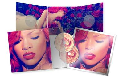
The front cover features a close up of the artist’s face, her hair is a vibrant shade of red which also pairs with her striking red lipstick, in this sense the colour red is immediately given connotations of love and lust, which goes hand in hand with the theme of her music and the pop/R&b genre. On the inside of the digi-pak we can see a long fold out image of the artist lying in a rose bush, again bringing back the colour of red with ideas of love, she also appears to be dressed in something that looks like a wedding dress, following on with the same theme. |
The iconography used in this digi-pak would be the colour red, the wedding dress and the roses; all of which create the idea of love to the audience. The style of the digi-pak remains in line with that of a the typical R&B/pop genre, the text featured throughout and mainly on the front cover is fashionable and modern, the simple title “loud” is a minimalistic sans serif font, it is a thin font and has as large spaces between the letter heads.
The editing of the images seems to have a blue-ish tint, as the shadows appear a navy shade of blue rather than black, this gives the images a softer look and ties back with the natural essence of the images. The blue also contrasts nicely with the rich reds that feature and is a much better artistic decision over the black that would of originally appeared before editing.
The editing of the images seems to have a blue-ish tint, as the shadows appear a navy shade of blue rather than black, this gives the images a softer look and ties back with the natural essence of the images. The blue also contrasts nicely with the rich reds that feature and is a much better artistic decision over the black that would of originally appeared before editing.
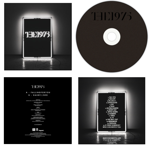
The illuminated square is the most eye catching part of the cover, along with the illuminated logo of the band name. The square is an iconic image of the band as it is used in the sets of their performances as well as being featured in some of their music videos. The all black cover represents the style of the band as well as working well with the bright white to make it standout and although is very simple, sums up the bands image.
The inside of the album folds out to reveal two landscape, similar images of the band in black and white. Black and white being the constant colour scheme of both the band their album, it reflects their cool, laidback personas as they are not in the business to be famous. Fans will again recognise the black and white theme as this is in many of their music videos. |
|
The block capitals and two lines, are something which is iconic to the fans as the band use this style on all their social media, such as twitter. The black and white again is used to maintain the simple theme of the cover. Like all album back covers, they have a clear track listing, and production details which are in a small print at the bottom as many fans will not be interested in this aspect.
Like many indie bands they do not feature themselves on the cover as they find their music is more important than them being recognised. On the sleeve, there is the band name in the same font as the album cover, which is easily recognisable by any fan. Furthermore the record label is also seen on the side.
Like many indie bands they do not feature themselves on the cover as they find their music is more important than them being recognised. On the sleeve, there is the band name in the same font as the album cover, which is easily recognisable by any fan. Furthermore the record label is also seen on the side.
Website analysis
|
Website #1
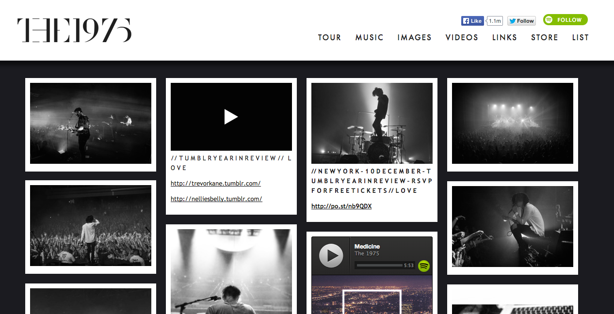
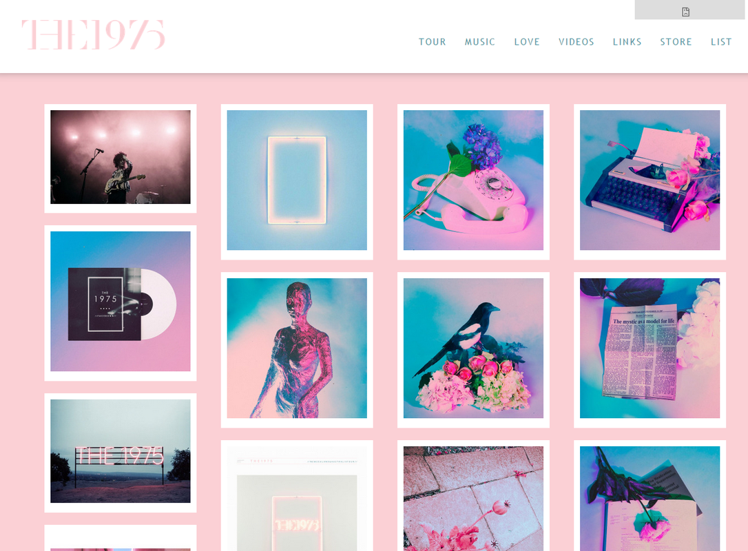
THE 1975 This is the website for The 1975 these are an Indie rock band. This website doesn't fit what you would expected from the indie rock genre because of the colour scheme used. The main page is very different as they have put loads of random pictures as their main page. They have a very clean neat look with a bar along the top with all the information links such as their tour and videos. The color schemes co-relate to that of their album. Their first album had a black and white theme where s the second album had a pastel pink and white theme with hints of blue. |
|
|
Website #2
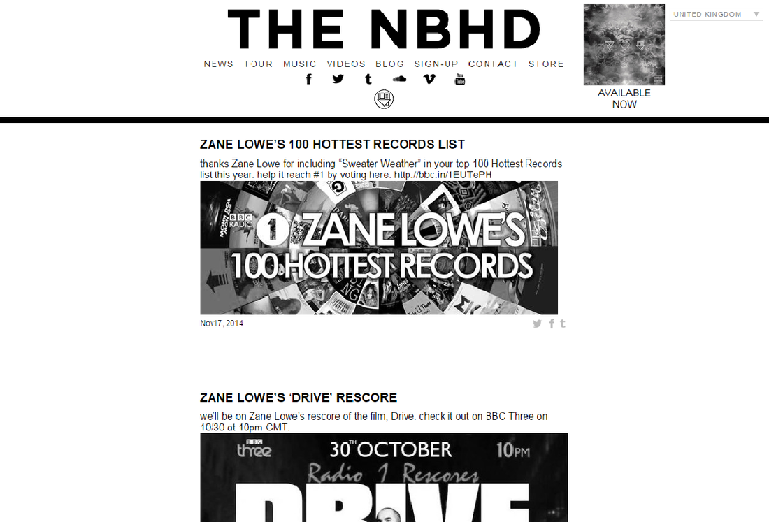
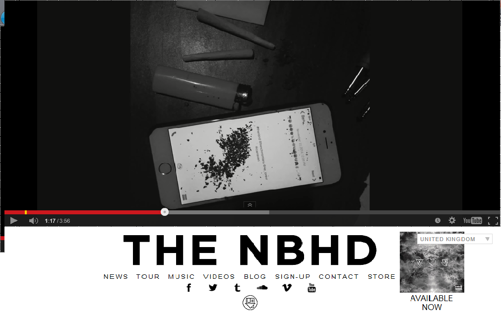
The NBHD (The Neighbourhood) an American Rock band that comes off as quite Indie. The bands sound is relatively 'moody' which made me think the web page would feature a lot of darker colours but surprisingly the primary colours are black and white. Having these two colours made the page seem cleaner and crisper. Because the only colours used are black and white you still get a sense of the 'atmospheric moodiness' of the bands sound. This also makes the site more memorable as it stands out for small quirks like this. The top of page has the bands logo and some sub-divisions of the website. The popular social media and networking site have been added below the the page links. Having the top media sharing sites linked to the page. At the top of the page there is a video, it stays on the same screen throughout. The image is an iphone 5s, a lighter and what they want us to think are two small joints. On the screen of the iphone is what could be either tobacco or weed and personally i'm more inclined to believe its weed as the whole idea of the image is to say that this is an edgy band. |
|
Digipk planning
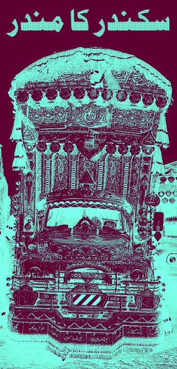
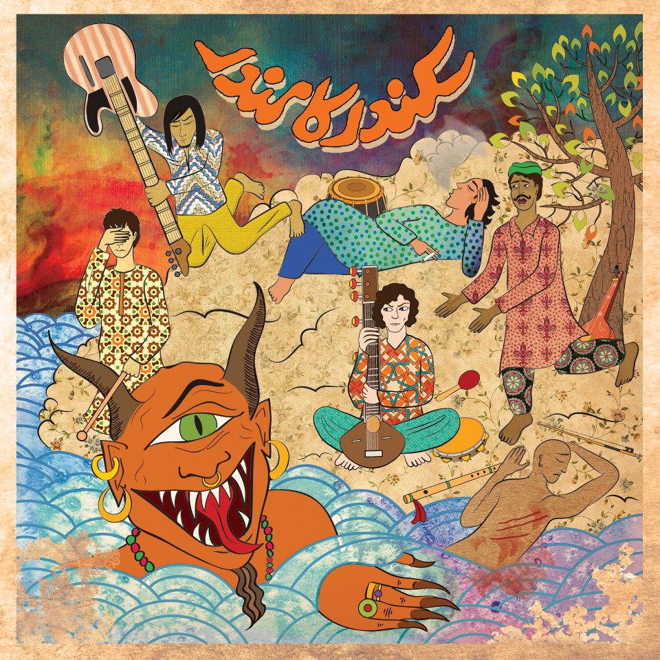
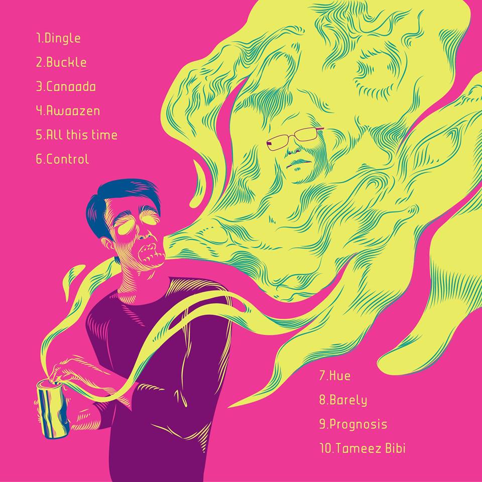
I noticed that pakistani artists tend to use digital art for their album covers and add a traditional hint to it sometimes aswell.